Apr
20
2020
20
Exploring Coronavirus Data with Calculus
Please note: I am a rocket scientist and former Calculus professor, but I am not a medical doctor or public health professional. This work should not be used for medical or operational guidance without consulting proper professionals.
When public health experts talk about flattening the curve, they generally show a graph with a curve bending over and we all have this mental picture of decelerating the rate of spread and limiting the number of new and active infections of coronavirus. The focus is on minimizing new cases so we reduce the daily load on our healthcare system. These graphs tend to be notional and convey the idea in a simple way everyone can understand.
As we track the actual spread of coronavirus, we shift to real data, tabulated daily. Many of the graphs we see show the total number of infections as a function of time, and look like this:
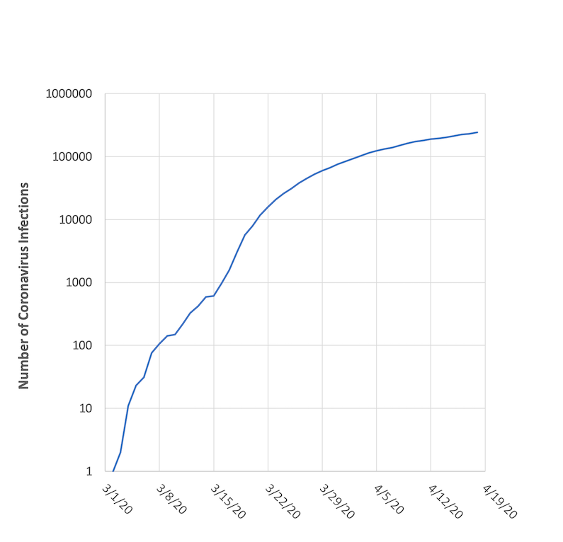
March 1 - April 18, 2020. Data from Johns Hopkins.
That particular graph shows actual data for New York state from March 1 – April 18, 2020. The curve is bending over and appears to be flattening. What is rarely mentioned, however, is that the vertical axis of the graph – the number of infections – uses a logarithmic (log) scale. Log scales are great for plotting data that has a wide range in magnitudes, and they are even better if you want to think about relative differences. On a log scale with base 10, the difference between 1 and 10 is treated the same as the difference between 10 and 100, 100 and 1000, and so on. Even the difference between 1,000,000 and 10,000,000 is treated the same. They all represent a factor of 10 change.
Let’s look at that same exact data plotted on a linear scale:
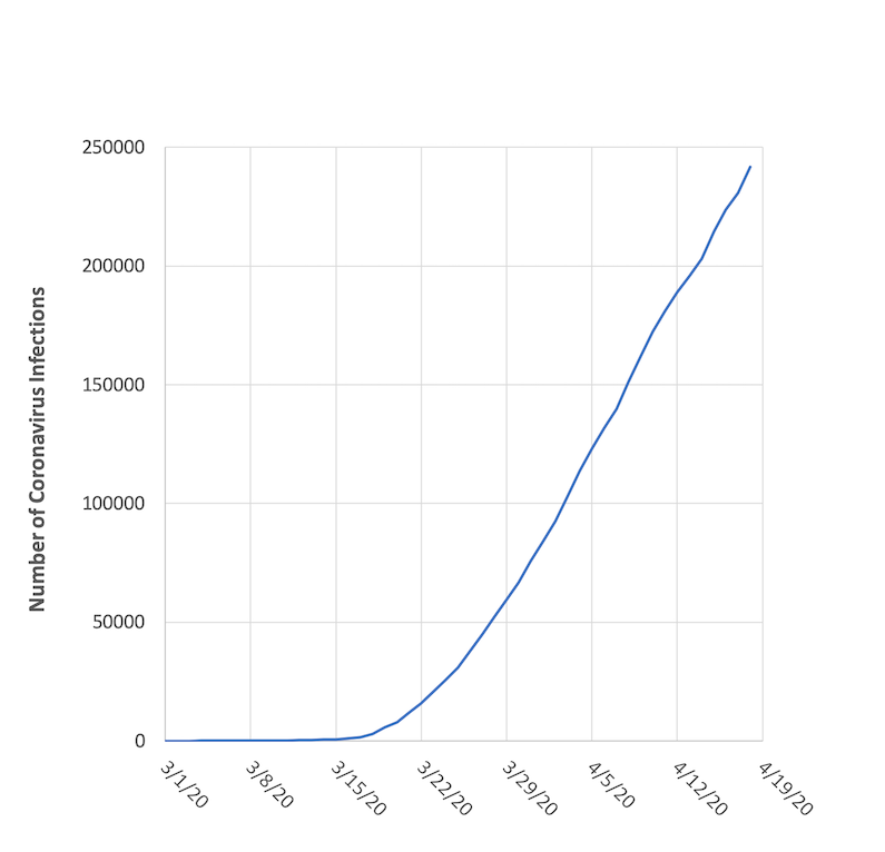
March 1 - April 18, 2020. Data re-plotted with a linear scale.
Looks a lot different, doesn’t it? In addition to showing a dramatic rate of growth, we see no flattening effect. While informative, this type of graph would cause widespread panic if it was interpreted literally. Because this graph uses a linear scale, it treats every new coronavirus infection the same. If we go from 1 to 2 cases (a doubling or 50% increase) it’s an increment of 1. If we go from 10 to 11 cases (a 10% increase) it’s an increment of 1. Even if we go from 1000 to 1001 (0.1%) or 1,000,000 to 1,000,001 (0.0001%) it’s still an increment of 1.
To me this is a more personal way to look at the problem, since you see an equal impact from each new infection no matter when it happens. But in the big picture, going from 1 to 2 infections early in a pandemic is a lot more serious than going from 1,000,000 to 1,000,001 infections later in a pandemic. The former represents a doubling while the latter is almost negligible (except to that unfortunate 1,000,001st person). So this is why we tend to use log scales for this type of data, as it helps put things into a relative perspective and helps us interpret the results more realistically.
To explore this and build a mathematical bridge from our linear “panic” curve to the calmer log curve, I want to pull in some basic Calculus and use it to work our way towards understanding the log scale and its effect. To start, I want to compute the first derivative (rate of change, or slope) of the NY data in our linear graph in Figure 2. If the data represents the number of infections as a function of time in days, the first derivative will represent the rate of daily infections.
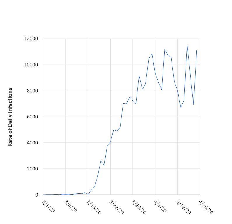
March 1 - April 18, 2020.
Here, we see that the rate of infections in NY increased pretty dramatically through March, but then settled into a range of 7,000 – 11,000 new infections per day. Think about that on a personal level, and it’s an insane amount of new infections every day. And it’s obviously a level that taxes our medical system. 7,000 – 11,000 new cases of any type of illness in a single day is a big deal. What’s more, these new coronavirus infections are coming on top of all the other medical cases that pop up every day. If you get anything out of this blog post, just think about that.
Back to the math, let’s try to put the number of new daily infections into some relative perspective. How does the 7,000 – 11,000 number fit into the big picture? The easiest way to do that is to normalize the daily rate by the number of infections. So we’ll do that by dividing the data in Figure 3 by the data in Figure 2.
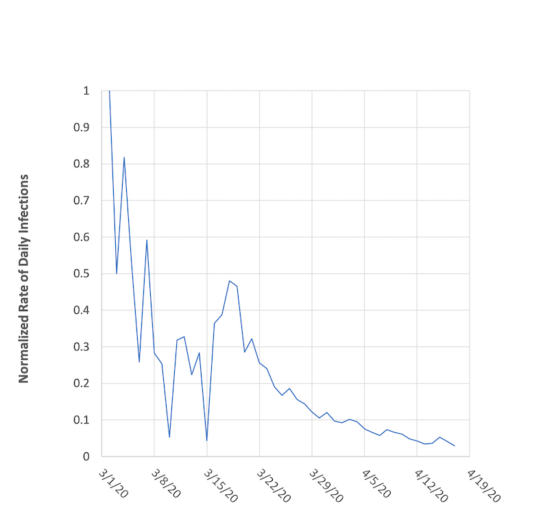
from March 1 - April 18, 2020.
When we do that, an interesting picture emerges, where we see a definite downward trend from March 18 onward. Even though NY is seeing a staggering 7,000 – 11,000 new cases every day, that is a smaller and decreasing effect on a relative basis, and it’s a promising sign. The date range of that trend correlates well with the implementation of social distancing and stay-at-home practices, and we see a pretty obvious mathematical confirmation of that.
By looking at the first derivative and putting it into relation with the raw data, we’ve taken a back door into understanding how a log scale works. In the process we stepped through a couple scary looking graphs, but showed that putting them together in a relative relationship shows a more promising picture. All of that was done with linear plotting scales, and it helps show the beauty of the log scale for this type of data. Without any analysis, the graph in Figure 1 offers a quick canned summary of the data in a way that puts everything into perspective. It lacks the detail and dynamics of Figure 4, but as a summary the log graph in Figure 1 works well.
Speaking of detail and dynamics -- one interesting thing you may notice when comparing all the figures is that going from the number of infections in Figures 1 and 2 to the rate of infections in Figures 3 and 4 revealed a whole lot more information that had been hidden. The curves in Figures 1 and 2 have a few wiggles, but are otherwise pretty smooth. Going to the derivative and rate in Figure 3 emphasized those wiggles, since the derivative is telling us about the slope of the curve and wiggles represent changes in slope. What looked like gentle wiggles amplified out into notable slope changes (these all likely have a story, whether related to local outbreaks or fluctuations in daily testing returns). Going from Figure 3 to Figure 4, the dynamic parts of the curve change. The curve in Figure 3 starts out a bit mild but fluctuates wildly in the last 21 days. The curve in Figure 4 does the opposite, and drives home the idea that spread in the early days is more dramatic, as we see rates of 50-100% and large fluctuations. In the last 28 days, the trend drives downward towards a 3% rate.
Now, I couldn’t end a post involving Calculus without showing a couple equations and going for a deeper connection (feel free to sign off now if you’re content). We know that many physical and biological processes follow exponential growth patterns, and the spread of a virus is often one of them. The very simplest form of a differential equation (DE) for exponential growth goes something like this:
If I let Q be some quantity and α be a constant of proportionality, I would write that DE as:
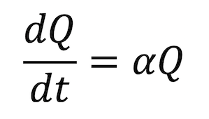
If you wanted to go on and solve that DE, you’d separate variables, integrate, and use a natural logarithm function to come up with an exponential formula for Q. We’ll skip that part, but note the nice connection back to the logarithm. Anyway, going back to the DE, if I just move things around a little, we get:
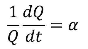
The left hand side of our equation is the first derivative of Q divided by Q, or in other words, the rate of change of Q normalized by Q itself. It’s the same combination we graphed up above in Figure 4. So in reality, when considering data from an exponential growth process, looking at the rate of change of the quantity normalized by the quantity really gives you the effective constant of proportionality α. In Figure 4, we’re seeing how α varies if we were considering the spread of the coronavirus to follow a simple exponential model from day to day.
In reality, spread of a virus is far more complicated than a simple exponential growth involving one differential equation and one quantity (indeed, that model will uniformly grow or decay only). So all we’re doing here is making a tie with Calculus, exponential growth, and the logarithm to come up with a good looking graph that confines exponential effects to day to day ranges. A more reasonable model would involve variables for infections, healthy people, deaths, and recoveries, along with a population size and assumptions for spread and containment effects. It would have at least three differential equations, maybe more. I’ll save that for a future post.
Thanks for reading.
The original, indispensable, pioneering AR viewfinder.
Where will you take it on your next adventure?